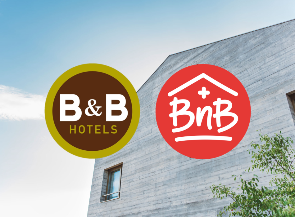
French budget hotel chain B&B Hotels recently went after BnB Switzerland, the umbrella organisation for Swiss bed and breakfast hosts. So why did the group decide to start a fight with the Swiss hospitality association? Its brand and logo, as the Handelszeitung business newspaper writes for subscribers in today's (04.11.2021) edition.
BnB Switzerland has not long undergone a complete re-branding, which also included a new logo. Managing Director Dorette Provoost thinks she knows where the problem lies. "We relaunched our website a short time ago, and changed our logo from a square border to a round format. B&B Hotels probably wanted to claim a graphical identifier for itself", she told the newspaper. The case ultimately landed before the Swiss Federal Institute of Intellectual Property (IPI).
The IPI presented two findings. Finding 1: "In this element, where meaning is concerned, the two marks under comparison here correspond, and there is also little difference in their respective fonts, although the verbal elements of the contested mark appear in two fonts, with one in the circle looking like handwriting, and the other to the right in a normal print font."
Finding 2: "The two marks under comparison therefore display a degree of overlap in their graphical arrangement, such that it can be said that they display a certain similarity." Yet BnB won the case, as Handelszeitung continues: "Apart from corresponding in their unremarkable graphical design overall, the two marks do exhibit significant differences at the deeper graphical level", reads the IPI ruling, a copy of which has been obtained by Travelnews. The ruling continues that there was no risk of confusing the two "even considering the sameness or marked similarity between the services under comparison, and assuming that the general public will pay them only an average degree of attention." The marks may therefore continue to co-exist without any danger of mistaking one for the other.
B&B Hotels did not offer any statement or comment on the case.


