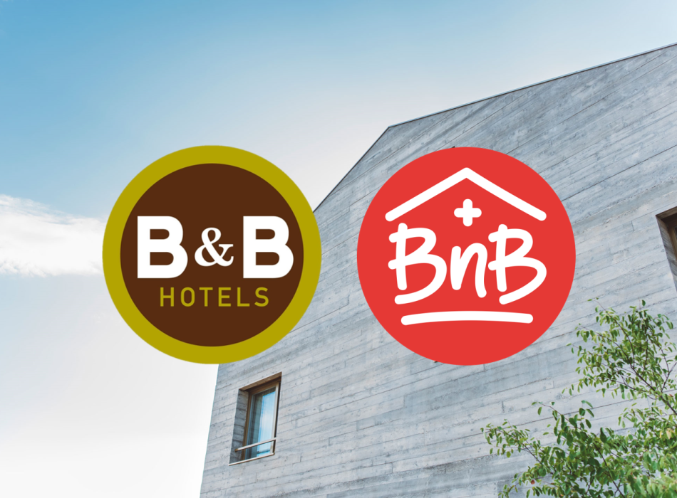
The french Budget-Hotelkette B&B Hotels ging kürzlich auf BnB Switzerland, die Umbrella organization of Swiss bed-and-breakfast establishments. Why is a corporation messing with the Swiss organization? Because of the brand and the logo, as the "Handelszeitung" writes in today's issue (Abo | 04.11.2021).
BnB Switzerland recently underwent a re-branding, and the logo was redesigned. Managing director Dorette Provoost suspects that this could be the reason for the spat: "We recently changed our logo with the relaunch of our website, from a square outline to a round format. Wahrscheinlich wollten die B&B Hotels ein grafisches Alleinstellungsmerkmal für sich reklamieren», sagt sie gegenüber der Zeitung. Der Fall landete schliesslich beim Eidgenössischen Institut für Geistiges Eigentum (IGE).
The IGE presents two findings. Finding 1: "The comparison signs coincide in this element with regard to the meaning, with regard to the typeface they differ only insignificantly, even though the verbal elements of the contested mark are in two typefaces, viz. the one in the circle in what appears to be handwriting, and the one to the right of it in a common printed script."
Finding 2: "Thus, the comparison signs also show certain overlaps with regard to the graphic design. Based on these overlaps, a certain degree of similarity between the signs must be affirmed." But BnB Switzerland is proven right, as the newspaper further writes: "Apart from the similarity in the graphic arrangement, which can be qualified as banal the characters show clear differences on the graphic level", says the IGE ruling, which Travelnews has also received. However, a likelihood of confusion is not present, "even taking into account the similarity or distinct similarity of the comparable services and assuming only average attention of the public to be negated". Thus, the marks can exist without any likelihood of confusion.
B&B Hotels hat übrigens No opinion or comment on the case described.